It will come as a surprise to precisely no-one who follows me on Instagram to learn that I wholeheartedly love a pattern clash. There are no rooms in my home which haven’t had pattern liberally splashed around via wallpaper, fabrics, cushions, bedding – I can’t help myself. I’m a minimalist’s nightmare. This isn’t to say I don’t also harbour fantasies of living in a clean lined, tranquil, white space but, sadly, I only have one house until I win the Euromillions.
One of the questions I get asked a lot on Instagram is how to mix patterns. What’s the formula, how can we distil down the overwhelming array of amazing patterns out there and get it right in our homes? And I’ve always been quite rubbish at answering that question, as it’s something I have always done by gut feeling and by eye. This isn’t to say I just breezily order a few bits in, pop them in a room and pat myself on the back for a job well done. It’s usually a long winded process involving weeks researching everything on the whole internet to find the perfect wallpaper/fabric/cushion and, frankly, I get on my own nerves. However, I’ve sat down, had a cup of tea, stroked my chin and tried to work out what, to me, makes a good pattern mix.
I’m going to preface this by saying I’m no expert, and have zero training in the art of pattern clashing. I deliberately haven’t read any expert analysis of the subject prior to writing this blog post. I just know what I like and what makes my heart happy, and I have masses of enthusiasm for the subject. It’s also far from exhaustive, but I hope a decent starting point. So, disclaimers done, let’s proceed!
1. Big pattern, little pattern (cardboard box)
Scale. This is important. Using differently sized patterns is a really useful first step towards getting it right. Start with one patterned thing, ideally the largest expanse of pattern you want to use in the room, so maybe wallpaper, or a sofa fabric.
On this subject generally, I’m going to suggest that you go with something you love with your whole heart. Lukewarm, as Roald Dahl said, is no good. This applies to interiors as much as it does to life in general – if you’re going to go down the pattern route, then it’s not like buying a neutral coloured sofa or painting a wall white, so that you can change up your scheme with relative ease. This is both a blessing and a curse for the pattern-enthusiast. Buying into pattern is more of a lifetime commitment (or at least a year or so, until you find a pattern you like even more).
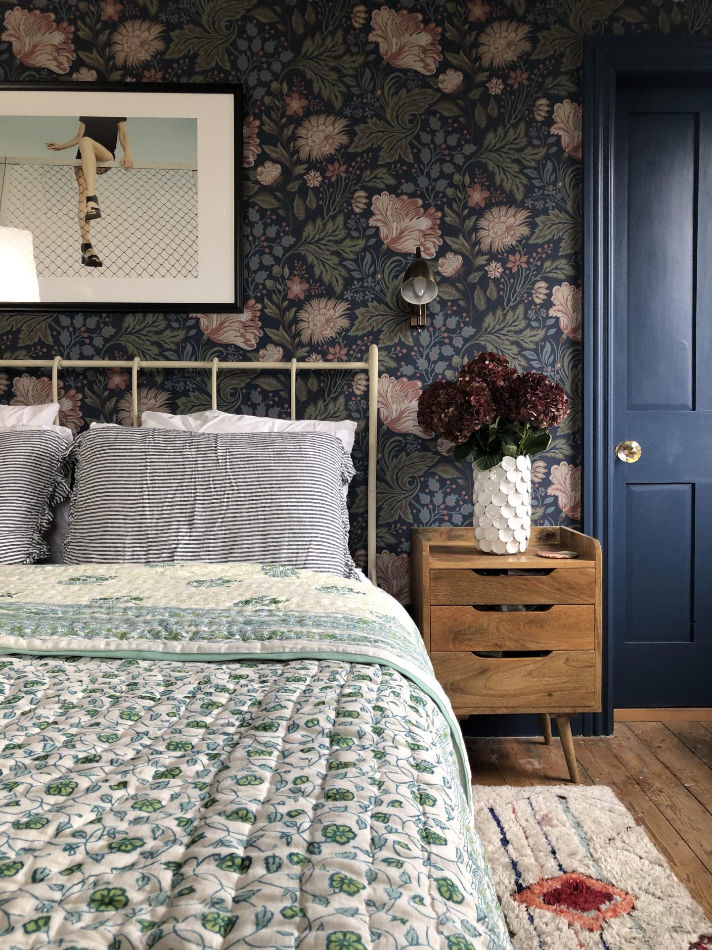
Let’s look at my bedroom as an example:
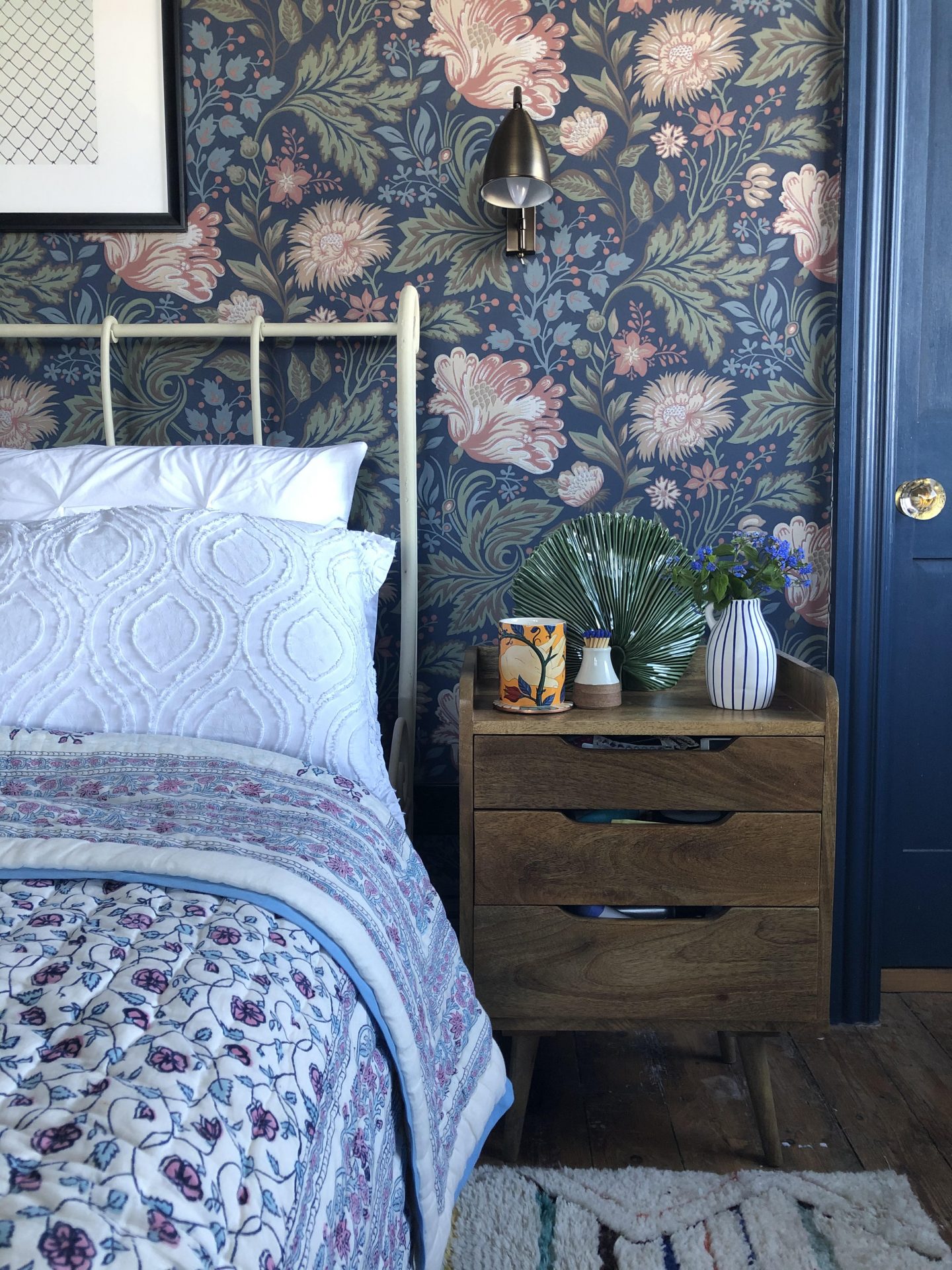
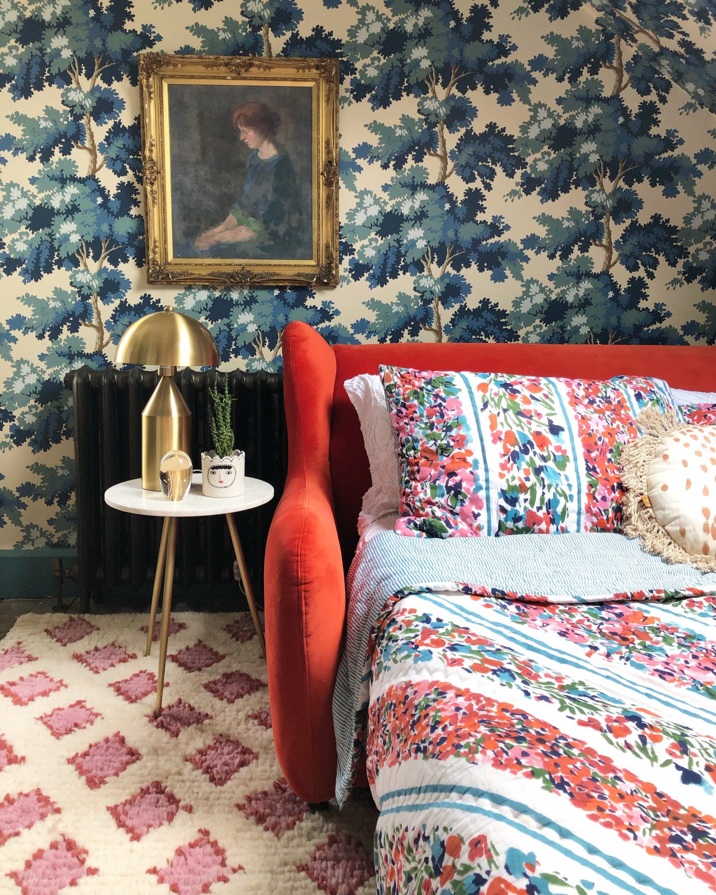
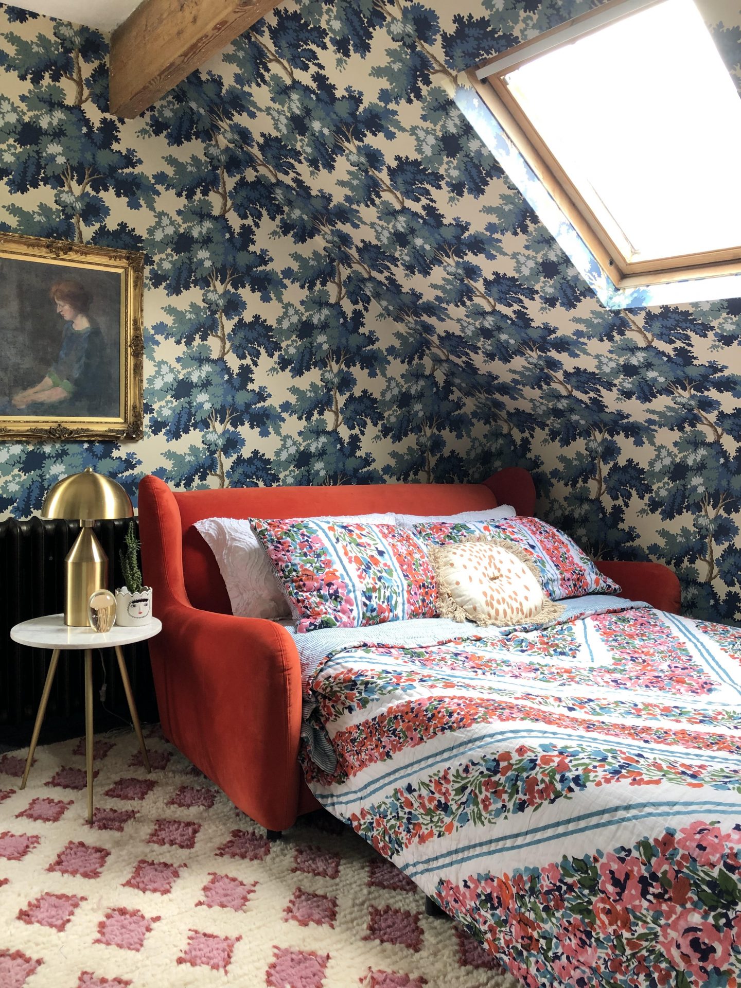
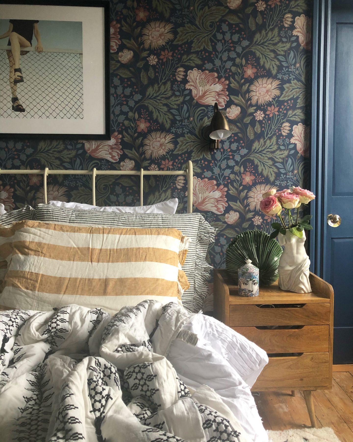
My starting point for this room was the wallpaper. I’ve had this in here for about 6 years and I love it as much now as the day it went up (it’s “Ava” by Sandberg Wallpapers). I’m an absolute sucker for a floral print, always have been. And just because I’ve used a whacking great floral on the wallpaper is absolutely no barrier to using another on the bedding! It just needs to be a smaller scale print and BOOM! We’ve done the double! If you imagine how it might look with a large floral print on the bed, then it’s suddenly become a bit hectic and overwhelming, hasn’t it? I love this bedspread so much, I have it in two colours – it’s from previous Instagram collaborations with my beloved Dilli Grey.
A pattern also needs to suit the surface you’re using it on. The effect of a large-scale print is lost if it’s used on a tiny cushion, in the same way that a tiny, ditsy, floral print on floor to ceiling curtains is hardly noticeable.
A final point to mention here is that I always include a “slice” of plain or neutral, to break up the pattern. While my bedspreads here are patterned, the bedding beneath is usually white, and the pillows in these pictures are my “slice”. On the left, it’s actually a fine blue (see point 2!) stripe (see point 3!), but it’s very subtle and therefore qualifies as a neutral. Well, it does in my house, anyway. It disrupts the pattern-fest just enough to create a bit of balance.
2. Colour: what’s your palette?
Your starting point here is to place your favourite colour, or a least one of them, in the heart of your patterned scheme. You need a main colour to work from, and then you can think about the supporting cast of others you might want to bring in to mix things up.
Again, this is something I’ve always done by instinct, but I’m afraid I’m going to have to bring in a bit of colour theory science to try and put it into words. For the right-brained among us, I appreciate that this is a struggle, but bear with me. I’m only skimming the surface for today’s purposes.
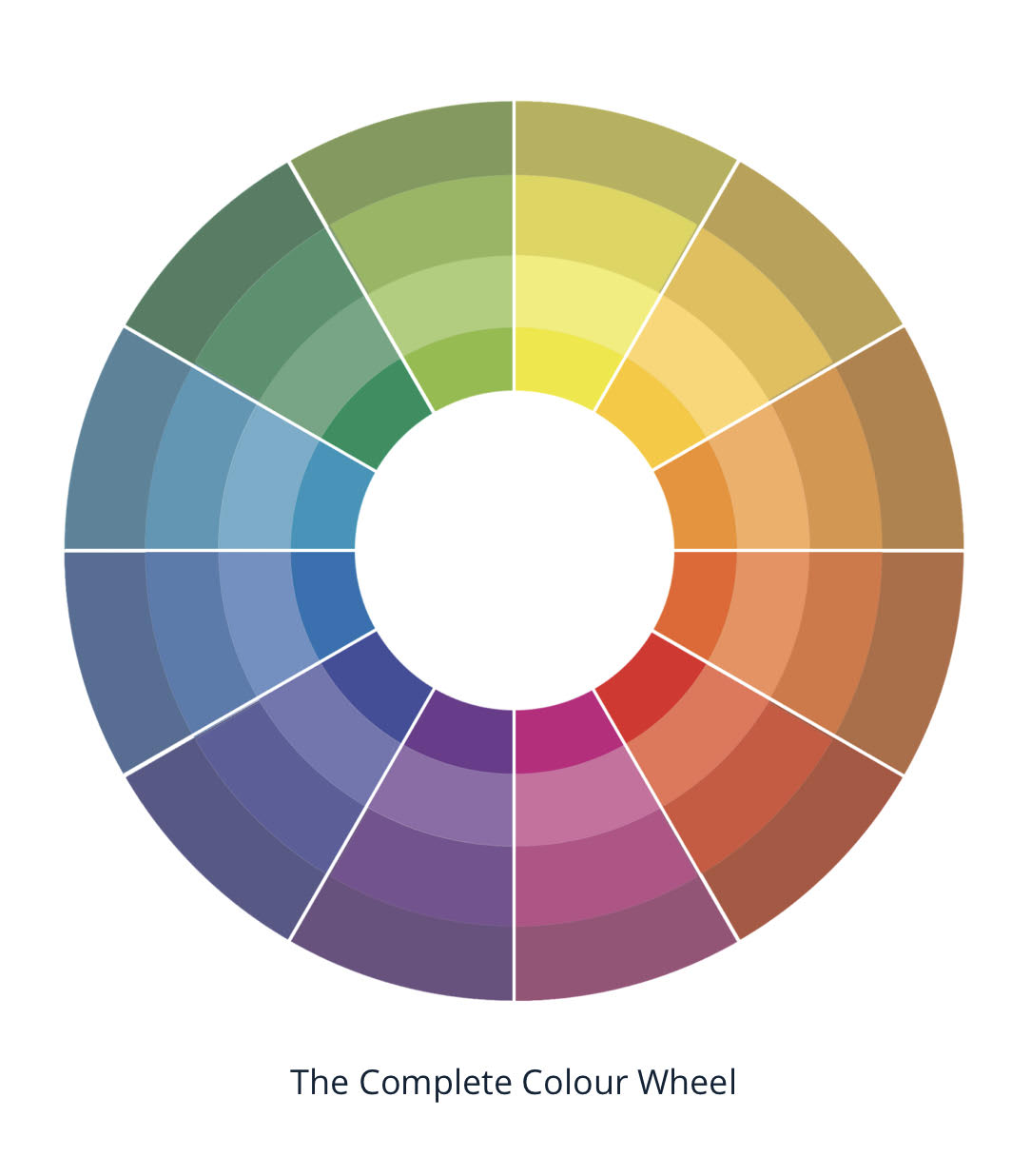
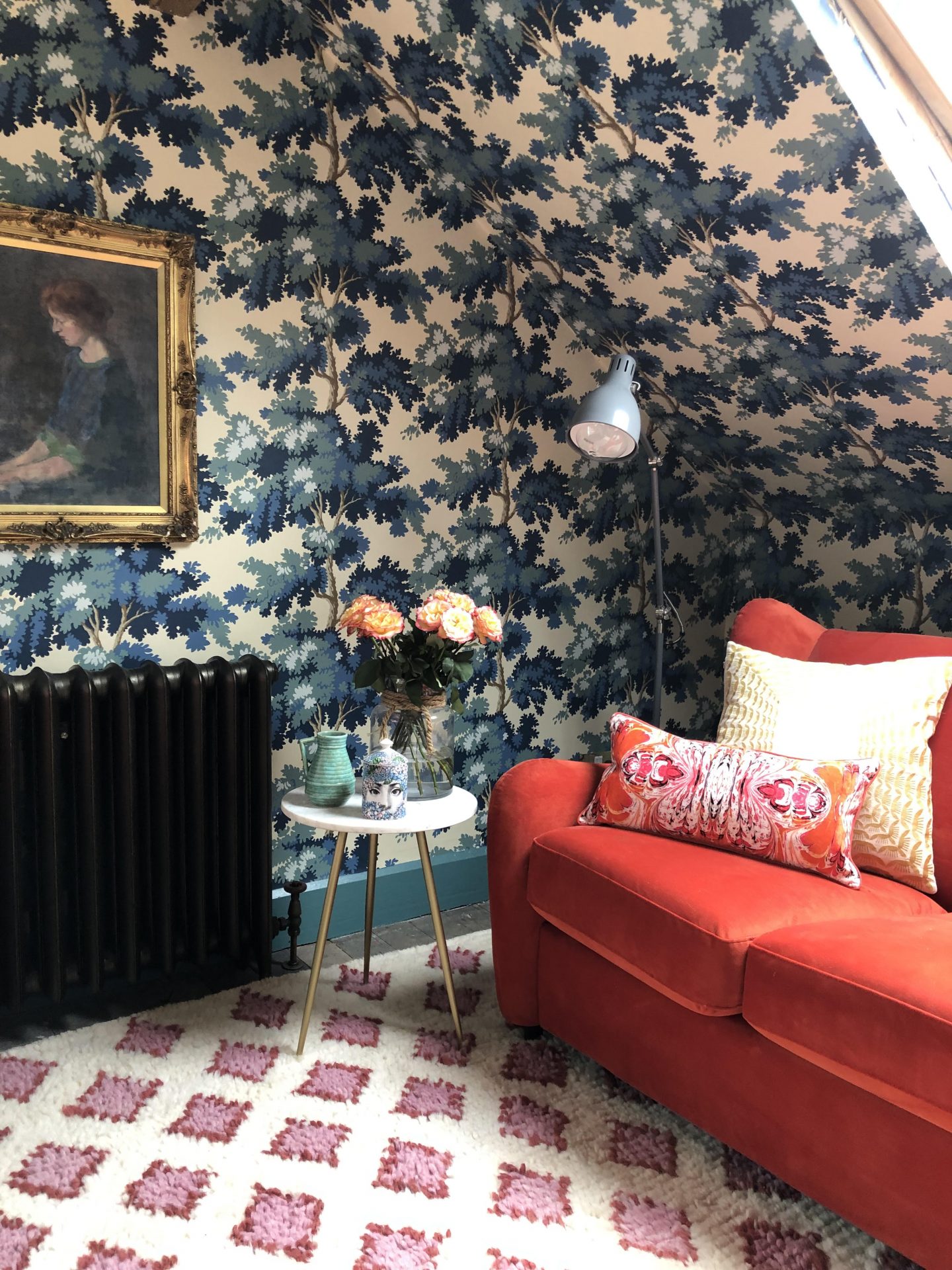
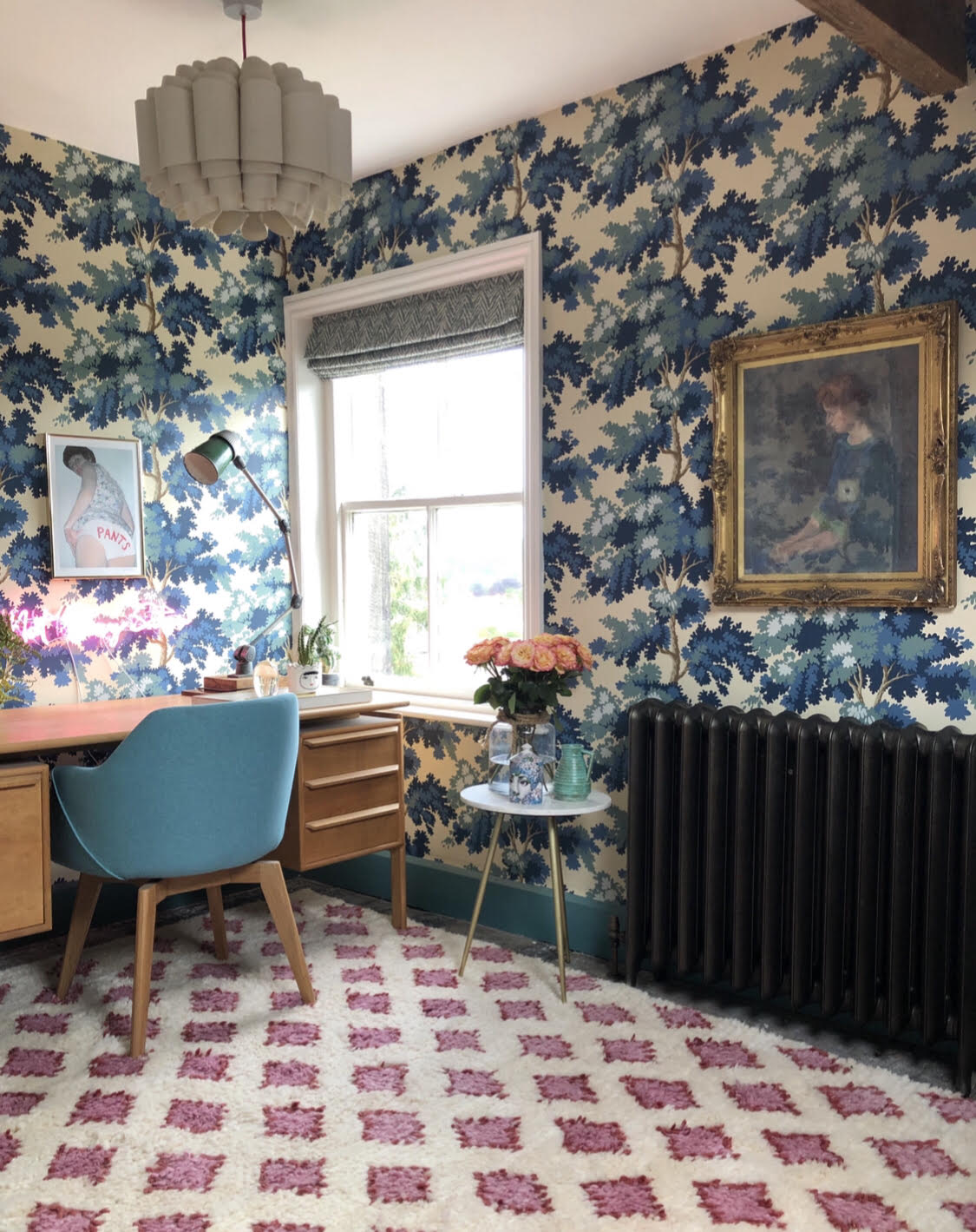
Ok. Concentratey-faces on. Here is a colour wheel. Isn’t it pretty? It shows all the different colours of the world. The left hand side is pretty chill, and the right hand side is a bit more excitable. Pick the colour you want to use as the base for your room, the main background colour of your pattern. I’m going to use my spare bedroom/study as an example here. It is by far the furthest I’ve ever pushed my own pattern clashing limits, and sometimes confuses people on Instagram (one lady once commented, befuddledly, “But nothing matches?”, which is precisely the point, Brenda).
Once again, my starting point was my wallpaper (“Raphael” by Sandberg Wallpaper), so blue was the base colour for the room. Now, using the colour wheel theory (and this is a massive over-simplification, as we’re all busy people), I could either:
1. Go for a harmonious scheme, using different shades of blue, or colours next to it on the wheel, such as green (I’ve done this in the bedroom shots, above); or
2. A complementary/contrasting one, using colours opposite to blue on the wheel, such as pink or orange.
We can see which way I went – clash it up, baby! I brought in the orange sofa bed (which is also my “slice” of plain colour, admittedly not the calmest slice, but a slice nonetheless), and a pink rug with geometric shapes (see point 3!). Whilst the bedding is highly patterned, the colours within the pattern are the same as in the wallpaper/sofa bed, keeping things focused, the scale of the floral print is smaller than the wallpaper (point 1!) and the pattern placed in straight lines (point 3!). Some may describe it as visually stimulating, some may be reaching for the migraine tablets, but I love this room.
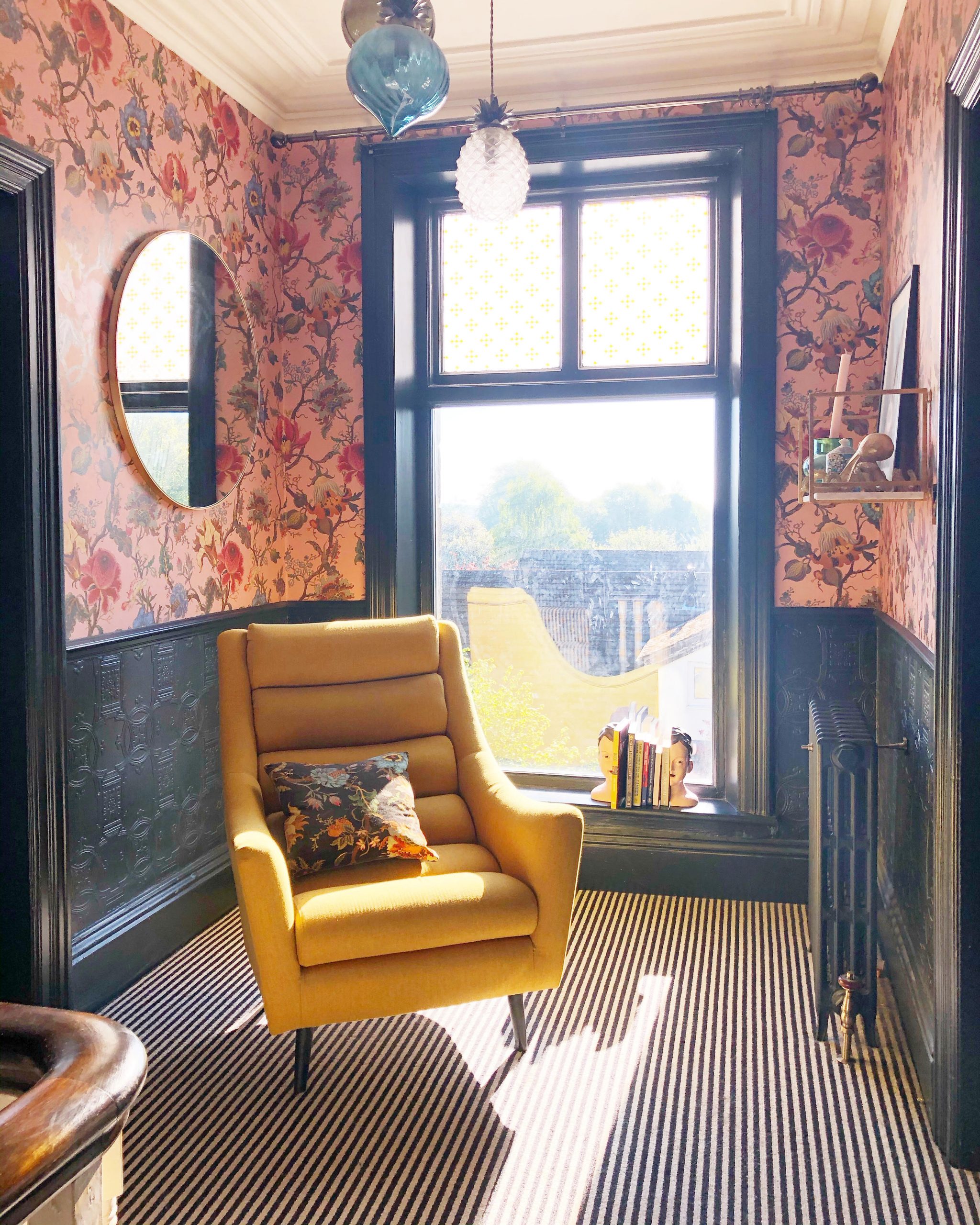
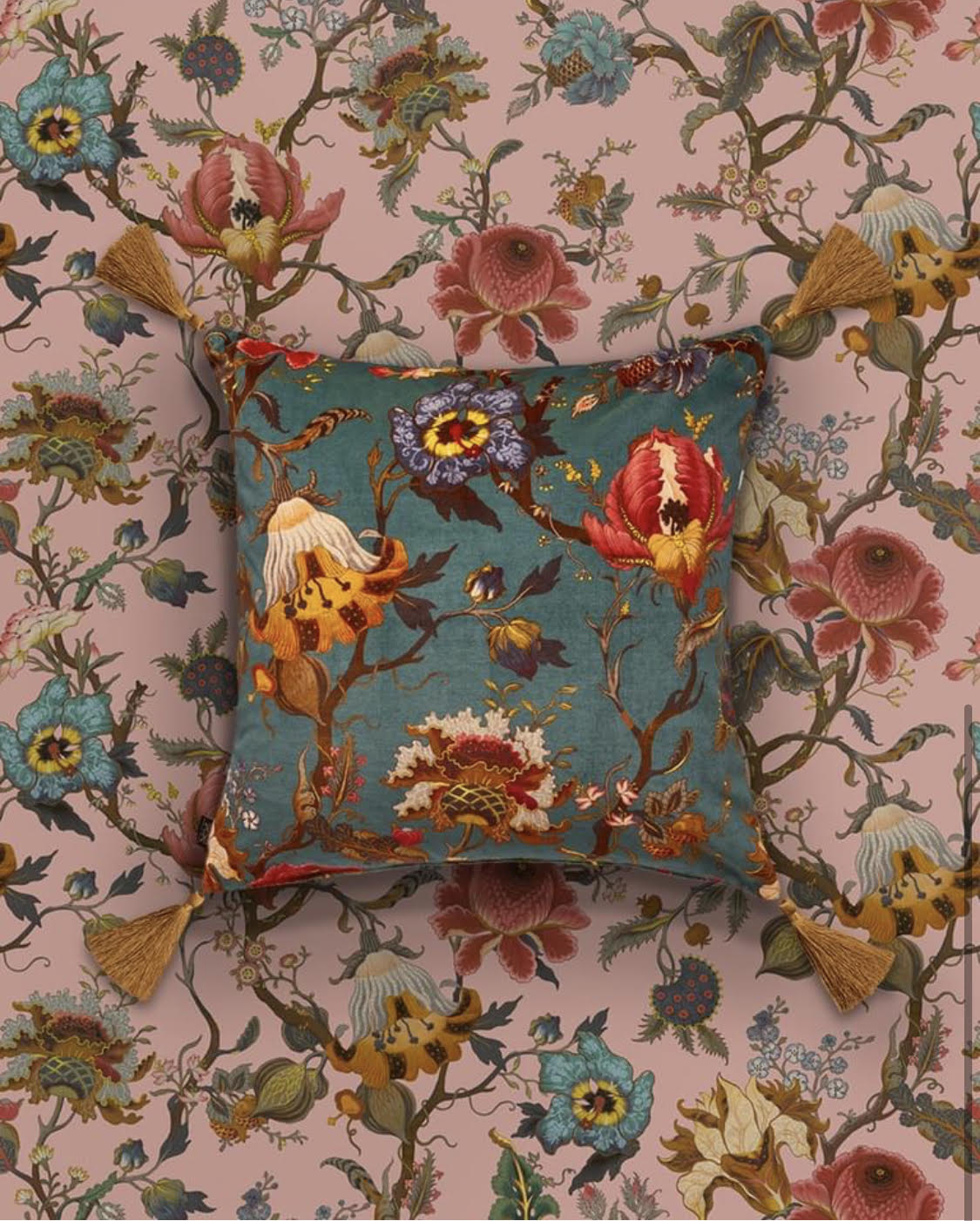
I want to mention one other colour technique which I adore, and that’s layering the same pattern in different colours. House of Hackney, one of my ultimate favourite design houses, and pattern clash extrordinaires, do this brilliantly, and helpfully have a huge range of their beautiful prints in different colours. Here’s a wee example where I’ve layered their pink “Artemis” wallpaper with a cushion in the black “Artemis” fabric, alongside a shot from their website using the same wallpaper but with the teal colour for the cushion. Gorgeous.
3. Opposites attract
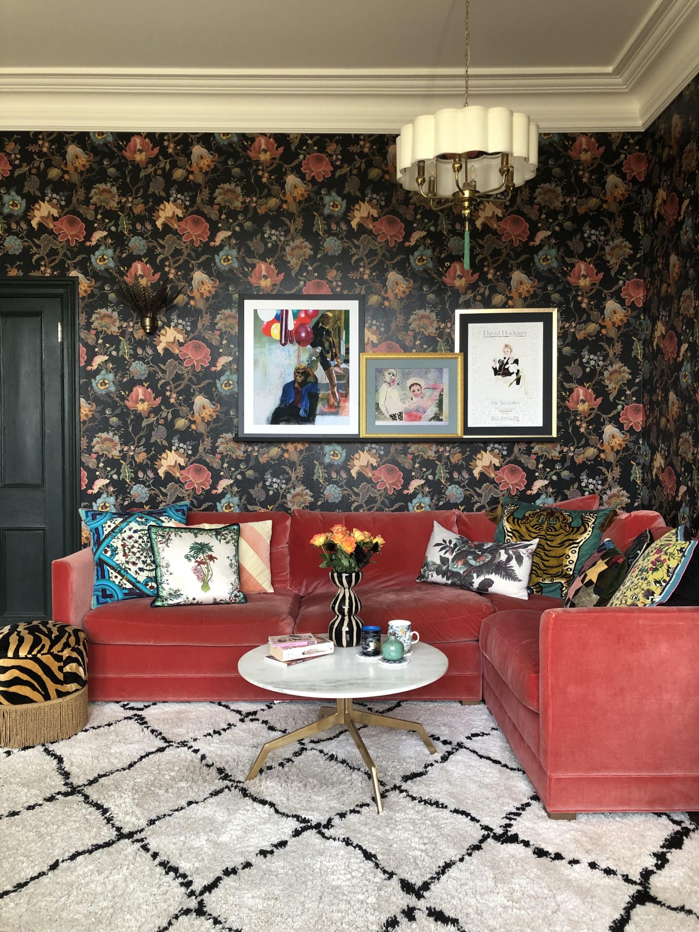
Not only an absolute 90s banger of a song by Paula Abdul and MC Skat Kat, but a useful principle to clash patterns by. I’m talking completely different themes which look great together. Usually one is complex and one simpler, such as a busy floral with a clean stripe, or a leafy-themed wallpaper against a spotty fabric. Animal print against floral is highly exciting. Geometric prints work well against most patterns. This is one best illustrated by example, so here are some ways I’ve done this in my house:
Clockwise from top right:
- The bedroom again, this time with striped pillows against the florals;
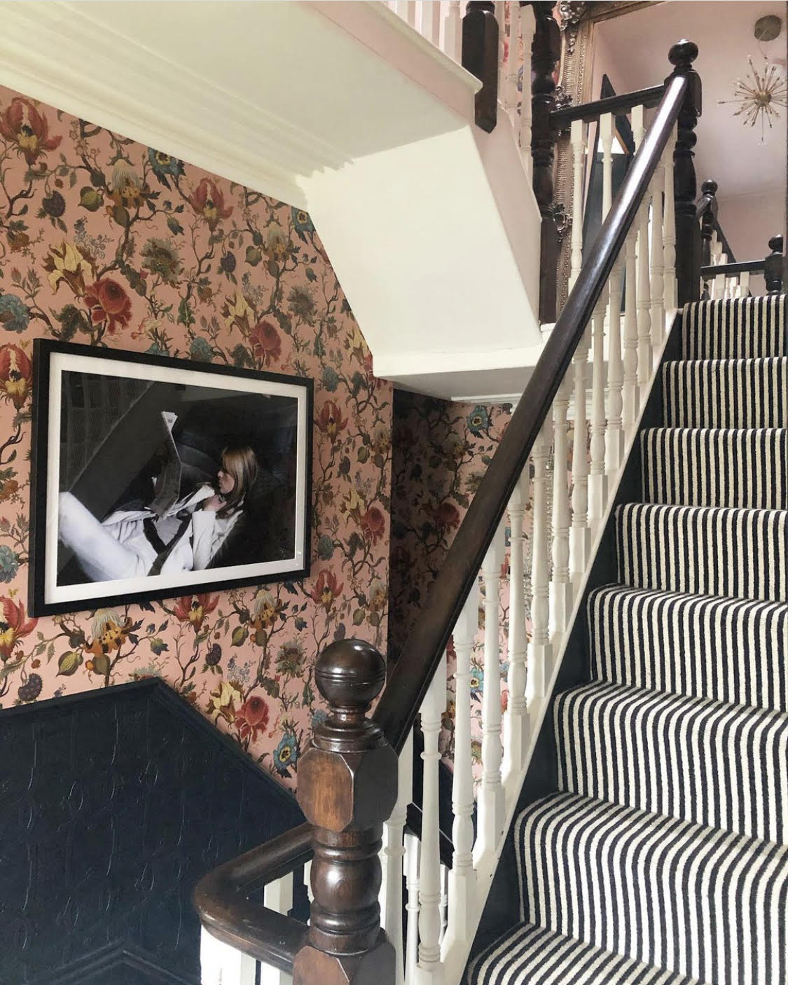
- The landing, with striped carpet against the floral wallpaper;
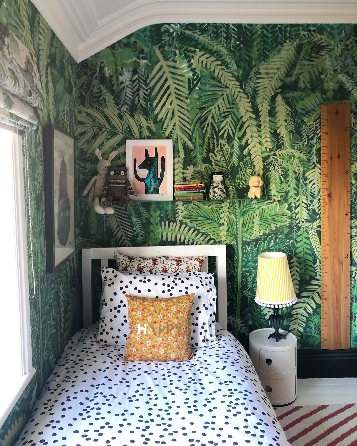
- Polly’s bedroom, spotty bedding against a forest themed wall mural (plus geometric rug. And floral cushions, because why not);
- The kitchen sofa sandwiched between (you’ll never guess…) floral wallpaper and a geometric print rug. Also a dash of animal print against the floral, from the footstool; and
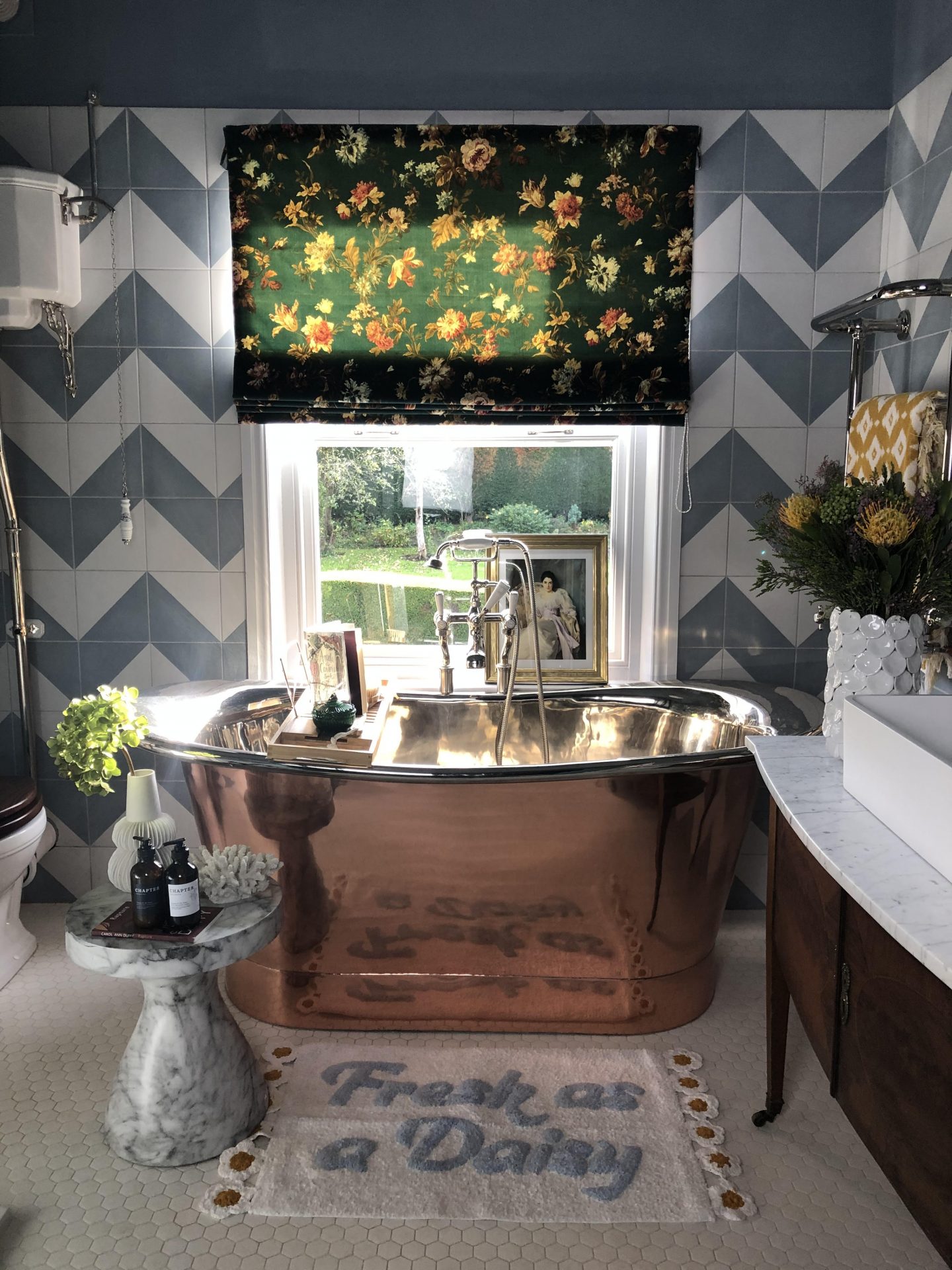
- The bathroom – large scale chevron tiles taking the lead here, with a smaller floral print on the blind.
There we have it! Is that of any use? I do hope so. Are you in the pattern-loving camp, or does it make you dizzy? Holler at me in the comments!

That was really useful, I’m not very brave at clashing patterns and I think I need to start.
Author
Yay, go on Joanne, get clashing 🙂
Really helpful thanks I love colour and pattern I’m hoping I have successfully done that in my scheme when it’s done I’ll find out !
Author
Oh brilliant, I’m sure you have 🙂
I absolutely love your spare room/study. Thank you for breaking down your process, I aspire to be braver with my use of pattern but just don’t know where to start sometimes!
Author
Thank you so much for reading! Wait until you’ve found a pattern you fall in love with and use that as your starting point 🙂
Hi Sandra
I adore every room of yours – patterns and colour all the way for me. So your method makes perfect sense to me (I think I tend to do likewise instinctively). Can’t understand Brenda’s perspective at all! That’s not to say I can’t see the absolute beauty in a minimal theme and admire those who can pull it off – I just can’t seem to do that in my own home as I’m naturally drawn to colour, pattern and intricate detail. x
PS thanks so much for the Friday phwoars this week – I immediately bought one of them for my husband! X
Author
Hi Amanda – apologies for my super late response, my comments weren’t showing up! Thanks so much for reading and I’m so glad it was helpful! We sound like we’re cut from the same cloth, pattern-wise 🙂
Love this! I am the total opposite, I love clean lines and simplicity, but love your home and your patterns. I’m going for wallpaper in my hallway and spending ages making sure the one I choose is, as you say, one I love with all my heart! Currently love all the Common Room prints, any others you can recommend that might work for a wallpaper-phobe like me?! x
Author
Oh I absolutely love Common Room papers, they’re beautiful! Have you looked at Ottoline Devries and Molly Mahon? Also very lovely x
Brilliant – thanks so much! That makes a lot of sense now you’ve set it out like that. I’ve spent lots of time looking at your amazing patterned rooms thinking ‘that shouldn’t work, but it does? How does it work?’ Theres’s still clearly a real knack to it. But this definitely helps as a guide! Bravo!
Author
Thanks so much for reading and for leaving such a lovely comment 🙂
Matchy-matchy is easy. It’s in pattern mix where the real talent shows 😉 Thanks for the “tutorial” on pattern mix/clash and many greetings from Germany!
I’ve been in love with your hallway from day 1 – the striped carpet ♥ – genius and so cool. Am in awe of your girls’ bedrooms (lovely Inchyra Blue) and adore your kitchen. Also very familiar with the struggle of an idealised, neutrals loving minimalist self living with one of everything (one cushion, one candle holder, one vase) vs a colour and drama loving maximalist with an obsession for all things fancy – give me cushionS, give me vaseS, give me table lampS and plenty of pretty cupS and glasseS!
Author
Ah Monika, thanks so much for reading and for your lovely comment! We sound like we’re cut from the same cloth 🙂
I really enjoyed reading your thought processes on this. Your Instagram is probably my favourite interiors account. I don’t think I could ever be quite so brave, but aspire to level up a little as we decorate our home. In the meantime I will enjoy your beautiful rooms / designs. (You really should publish the pictures in a book ?)
Author
What an absolutely lovely thing to say, thank you so much for reading and taking the time to comment 🙂
I really like your wordpress template, exactly where do you get a hold of it through?
Author
Thanks! Its a Pipdig theme, you can find it on their website – think it’s called Blossom
Hey esto es un gran poste. ¿Puedo utilizar una porción en ella en mi sitio? Por supuesto ligaría a su sitio así que la gente podría leer el artículo completo si ella quiso a. Agradece cualquier manera.
Author
Yes, of course, as long as you link back 🙂 Thank you
ABSOLUTELY GORGEOUS!! Best home on Instagram. Love every room 💙💙💙💙
Author
That’s incredibly kind! Thanks so much Toni 🙂